It’s 2026, the holiday lights are down, and a lot of homes suddenly feel a little plain. You walk into the living room and think, “Why does this look colder than I remember?” The cool neutrals that felt crisp a few years ago can read flat now, especially in winter light.
This year’s trending paint colors are swinging warmer and more grounded. Think earthy tones that make rooms feel lived-in and inviting without looking “too much.” They add depth, hide everyday scuffs better than icy shades, and pair nicely with wood floors, brick fireplaces, and furniture you want to keep.
If you’re planning an update around Richmond, Virginia, these 2026 color directions are especially practical.
The Hottest Paint Color Trends For 2026
Warm, nature-inspired colors are leading the pack. They’re not loud, but they do have presence, the kind that makes a room feel finished. Because they’re rooted in browns, greens, and softened whites, you can mix them without the house feeling chaotic.
Rich Espresso browns with Charcoal Undertones
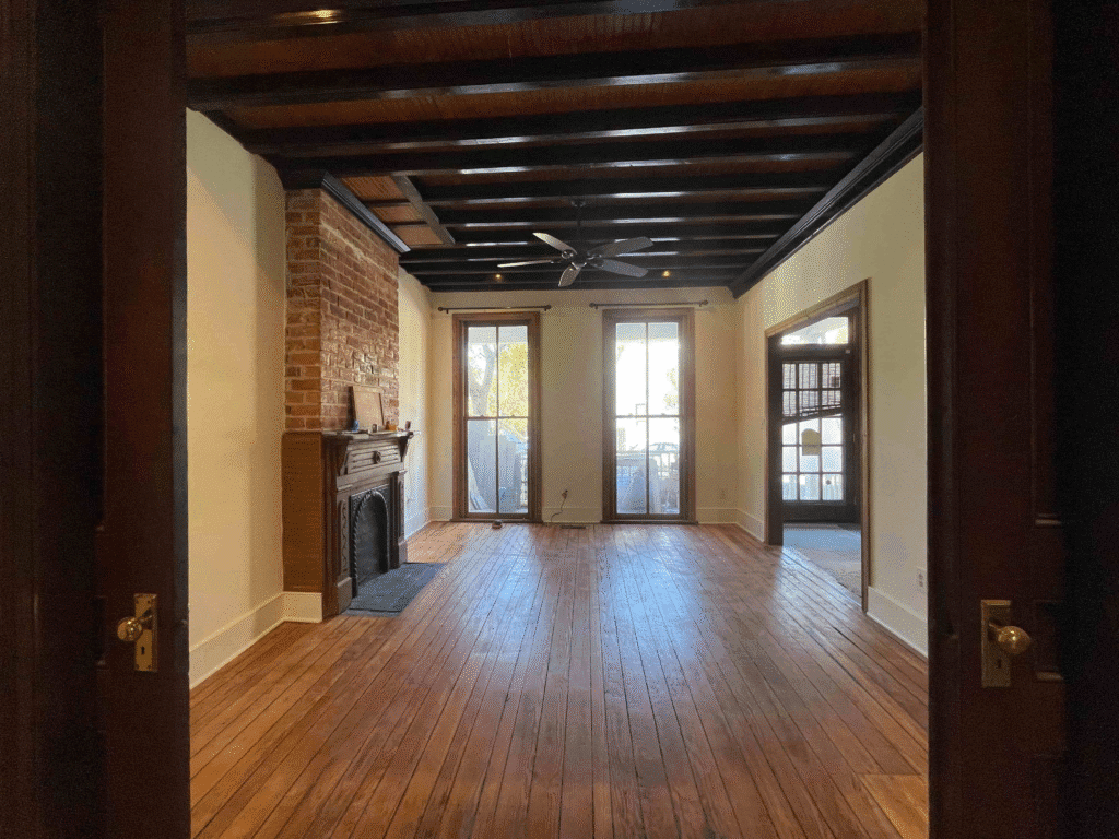
Deep browns are back, but they’re smoother and more modern than the heavy shades people fear. They shine in dining rooms, offices, powder rooms, and bedrooms where you want a cozy, intentional mood. If a full room feels bold, use it on a feature wall or built-ins, then soften it with warm white trim and textured fabrics.
Warm Khaki Neutrals
Khaki hits the sweet spot between beige and greige. It’s calm, easy, and warmer than the cool gray trend that’s fading. It works beautifully in hallways, living rooms, and open-concept spaces because it connects rooms without feeling boring. It also plays nicely with common Richmond finishes like honey-toned hardwoods, brick accents, and natural stone.
Smoky Jades and Muted Greens
Greens are still strong in 2026, but the “new” greens are slightly dusty and toned down. They add personality without screaming for attention. Smoky greens look especially good in kitchens, home offices, mudrooms, and on cabinets or built-ins. Pair them with creamy whites, medium woods, and warm metals for a balanced look.
Warm Eucalyptus Greens
This is the softer side of green, fresh, calm, and a little nostalgic. It’s a natural fit for bedrooms and bathrooms because it feels clean without being sterile. It also works well in rooms with lots of tile or stone, where you need a color that won’t fight your fixed finishes.
Soft, Lofty Whites
Bright white isn’t disappearing, but the most popular whites are gentler now. They have a touch of warmth, which keeps rooms airy without looking sharp. These whites are ideal if you want a bright backdrop for art, you’re updating trim and ceilings, or you love a clean look but still want your home to feel inviting.
Colors That Are Falling Out Of Favor In 2026
Nothing is “illegal” in paint. If you love a color, you can absolutely keep it. But you can feel the shift in what people are choosing when they repaint. Many homeowners are moving away from tones that feel cold, stark, or one-note.
- Cool grays are the biggest example. In rooms with limited natural light (or north-facing windows), cool gray can lean bluish and make a space feel distant. Many people aren’t rejecting gray completely. They’re replacing it with warmer, more flexible neutrals that still feel clean.
- Stark whites are also losing ground. They emphasize shadows, highlight wall imperfections, and can create a “blank box” effect in everyday homes. A slightly warmer white often gives the same bright look, with a softer feel.
- Icy pastels and overly sweet pinks are fading in the main living spaces. They can still be charming in a nursery or a playful powder room, but most homeowners are choosing grounded colors for the rooms they’re in every day.
- Very cool blues and blue-greens are stepping back too, especially when they read icy. Blue is still popular, but it’s trending deeper and richer (think inky navy) rather than crisp and chilly.
Highlighting The Standout Colors Of The Year
If 2026 has a theme, it’s comfort. The standout colors are the ones that make a room feel welcoming the second you walk in, and still feel good after the “new paint excitement” wears off.
What separates a “wow” color from a “why does this look weird?” color is usually undertone and depth. A warm brown with a subtle charcoal note feels sophisticated instead of muddy. A smoky green reads calm instead of loud. A warm white stays bright without turning harsh. Those undertone details matter even more in real homes, where paint interacts with floors, countertops, cabinets, and changing light.
These colors also work as a palette. A simple approach is to pick one main warm neutral (soft white or khaki) for most rooms, add a muted green in a kitchen, office, or built-ins, and save espresso for a dining room, powder room, or accent area. You’ll get variety without the house feeling mismatched.
How To Choose Colors That Truly Work For Your Home
Trends are helpful for ideas, but the best color choice is the one that fits your home and your life. Before you commit, zoom out and look at the full picture.
Start with what won’t change easily
Flooring, countertops, brick, tile, and cabinetry are your anchors. Your wall color should complement them by matching undertones, or intentionally contrast them with a clear plan.
Pay attention to the light direction
North-facing rooms often look cooler, so warmer paint helps them feel balanced. South-facing rooms get more warmth and can handle softer, muted tones without looking dull. If a room feels dark, a warm off-white can brighten it without looking stark.
Test bigger than you think
A tiny chip won’t show you how the color behaves next to your trim and furniture. Paint large samples (or sample boards), and check them morning, afternoon, and evening under your actual lights.
Think about the mood
Do you want a room to feel energizing, calm, cozy, or airy? Bedrooms and dens can handle deeper tones. Busy family spaces often do better with forgiving mid-tones and washable finishes.
If you want the quickest “safe win,” choose a warm, soft white for main spaces and add trend color in smaller, high-impact areas, like a powder room, a built-in, or a front door.
Expert Tips For A Flawless Update
A great color can still look disappointing if prep is rushed. The “pro” difference is usually the unglamorous part: clean walls, smooth patching, proper priming, and careful edges.
- Prep before you paint: Clean oils and dust, patch holes, sand rough spots, and prime repairs or stained areas. This prevents flashing (those dull or shiny patches) and helps the finish look even.
- Choose sheen on purpose. Matte hides imperfections but marks more easily. Eggshell is a popular wall choice because it cleans better. Satin can work well in kitchens and baths. Semi-gloss is ideal for trim because it’s durable and gives that crisp contrast that sharpens a room. If you want to make things easier, use paint sheen guidance as a solid reference.
- Don’t ignore trim and ceilings. A warm wall color usually looks best with a slightly warm trim white. If you want contrast, you can go cleaner on trim, but ultra-bright whites can feel sharp next to warm paint.
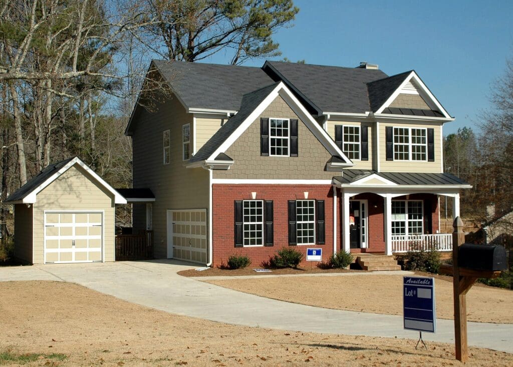
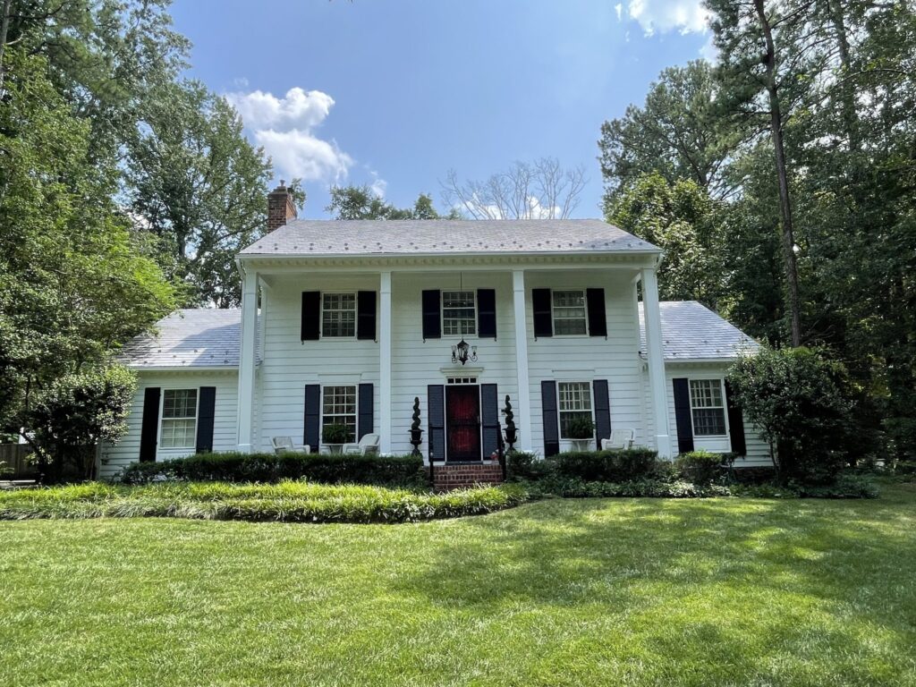
- Exterior is a different challenge. Sunlight, shade trees, brick, roofing, and landscaping all change how paint reads.
Bring These Trends Home Today
The best 2026 colors aren’t trying to impress strangers online. They’re meant to make your home feel good to live in.
When you’re ready to turn those “we should repaint” thoughts into a real plan, Proper Painters keeps it refreshingly straightforward. We’re based in Richmond, VA 23235 and serve Richmond and the surrounding areas. Want up to 10% off as a new client and a finish you feel good about? Call 804-592-6929 or email mailto:Office@ProperPainters.com. Hours are Monday to Saturday, 8:30am to 6pm.